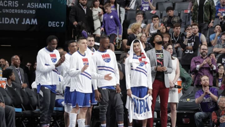
The Sacramento Kings recently released their city-edition uniforms to the public, and it is easy to say that many in the community are not impressed.
The day after the Sacramento Kings defeated the Phoenix Suns, the team released to the public what their city-edition uniforms would look like this season. And needless to say, the fans are unimpressed.
When seeing the uniforms first hand, they look fine to me. The jersey’s base color is red which makes it a nice change of pace compared to previous designs and the jersey being labeled “Sactown” is prideful for the people of Sacramento.
With that said, however, these uniforms are a continuing problem that the organization has had in the last three years.
https://twitter.com/SacramentoKings/status/1197182817832095745
The Problem
When looking at these uniforms, it is the same design they had compared to last season, but instead of baby blue being the base color it is red. Even going back two years, the uniform was the same design, except the team’s secondary logo was on the chest and not “Sactown”.
I don't know if it's Nike's problem, I don't know if it's the Kings' problem - but the city edition jersey designs have been remarkably lazy compared to what other teams are doing. pic.twitter.com/jxqWAA5MaY
— Tony Xypteras (@TonyXypteras) November 20, 2019
The problem is not the design itself, but rather the lack of creativity and effort that seems to be put into the design each year. Since the city-edition uniforms entered the NBA, most teams have showcased different looks each season and they have looked awesome. The fact that the Kings keep making these minor changes is just a sign of laziness.
Final Thoughts
I do not know whether Nike is to blame or the Kings, but I do know that the city-edition uniforms for the Sacramento Kings need to change. Fine, have the red ones this season. But once the 2020-21 season comes along, I hope Nike and the Kings can brainstorm and come up with a new design that will get Kings fans excited about the new threads that their team will rock on the court.
