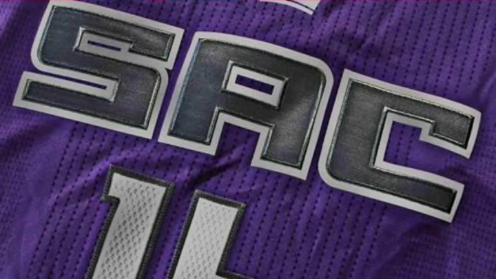
Sacramento Kings Unvail New Logos And Possible Uniforms

Yesterday the Sacramento Kings organization unveiled a set of brand new team logos. The Kings will be starting off their first season in their new downtown arena sporting a new look.
In a press conference in front of Golden 1 Center, Tuesday morning the team revealed the new image for the Sacramento Kings.
More from Kings News
- 3 Ways Chris Duarte improves the Kings chances in 2023-24
- Bleacher Report crazily lists Kings’ All-Star as “most overrated NBA player”
- Kings and Heat fans clash on Twitter to debate All-Star players
- Sacramento Kings’ Chris Duarte playing in 2023 FIBA World Cup
- 3 Young players the Kings must develop, 2 to give up on
A redesign was long overdue for the franchise. Even though it was expected, it is fitting that the Kings will have a new look to go with the new high tech arena. The new designs are simple and slick. And it appears the majority of Kings fans have responded well to them.
The new main logo is a call back to the old Sacramento Kings.
""
The merging of the old look with their current colors was a nice way to incorporate the history of the franchise as it goes into the (hopefully) successful future.
There are also alternative secondary logos, including a SAC, lion’s head, lion crest, and crown design.
Even ESPN’s Zach Lowe was impressed by the new designs, saying in his podcast “The Lowe Post,”
"“This is the best thing the Kings have done since trading for Chris Webber.”"
The new uniforms have not been officially revealed yet. But the Kings did give us “a peek” at them on their website.
Using the "leaked" Kings uni image, here's my guess at the look of the full top: pic.twitter.com/NlqxlQzJoF
— Conrad Burry 🔴🐐🎨 (@conradburry) April 27, 2016
Conrad Burry did some guestimation mock-ups for the uniforms over at Sportslogo.net. He believes they could look a lot like this:
More from A Royal Pain
- 3 Ways Chris Duarte improves the Kings chances in 2023-24
- 5 Players the Sacramento Kings never should have signed
- Bleacher Report crazily lists Kings’ All-Star as “most overrated NBA player”
- Kings and Heat fans clash on Twitter to debate All-Star players
- Sacramento Kings’ Chris Duarte playing in 2023 FIBA World Cup
Look at the lion’s head on the shorts!
The Kings new home arena and new logo designs appear to be headed in the right direction. Hopefully, the team will be heading the same way next season. What do you think?